FRnOG #36: Akvorado
Vincent Bernat
Here are the slides I presented for FRnOG #36 in September 2022.
They are about Akvorado, a tool to collect network flows and
visualize them. It was developed by Free. I didn’t have time to
publish a blog post yet, but it should happen soon!
The presentation, in French, was recorded. I have added English subtitles.
Update (2024-01)
Akvorado was also presented at LACNOG 2023 by Saymon Araújo, and at SwiNOG#38 by Will van Gulik.
Transcript#
Hello. I will show you a new tool called Akvorado. It collects network flows and displays them.
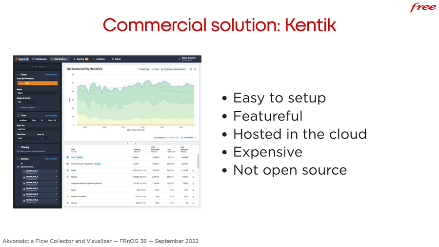
There are several existing solutions for this. For example, a commercial solution is Kentik. It is easy to setup and it is bundled with a lot of features. It’s hosted in the cloud. It’s expensive and it’s not open source at all.
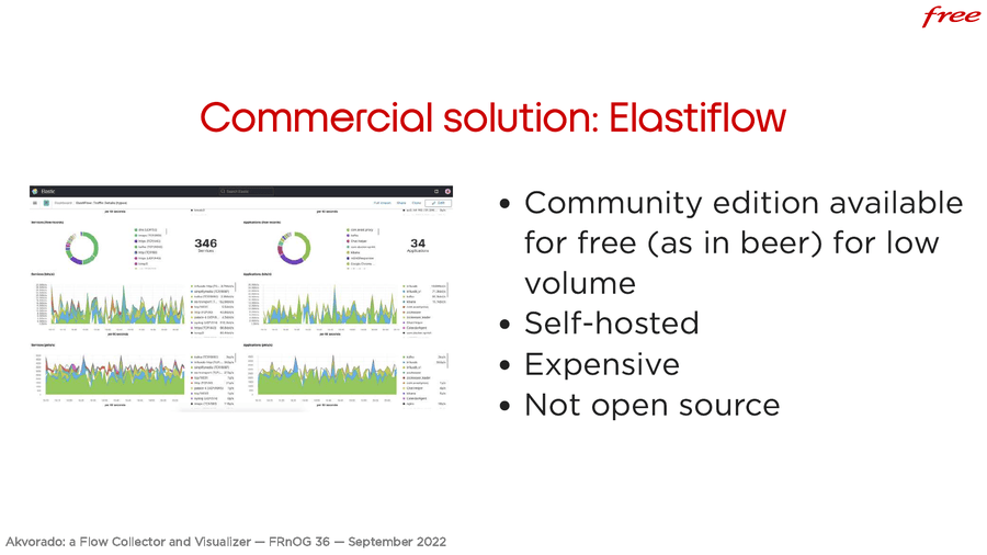
Another commercial solution is Elastiflow. Previously, it was open source, but not anymore. This time, you need to host it yourself. There is a free version that can handle up to 4000 flows/second. You need to pay if you want more.
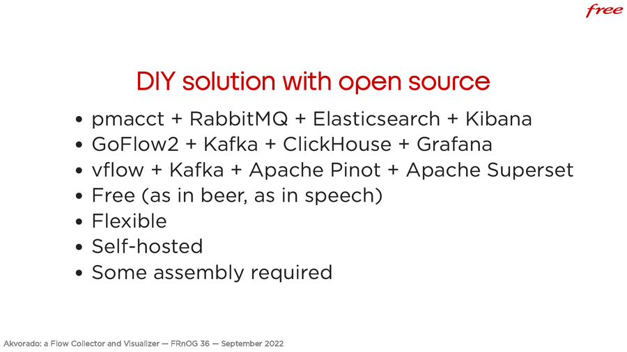
And there are solutions you can build yourself using open-source components. pmacct with RabbitMQ and data stored inside Elasticsearch. You can browse the results with Kibana. You can also use GoFlow2, export the data to Kafka, and store them in ClickHouse. You can leverage Grafana to display the results. Another combination is vflow, Kafka, Apache Pinot, which is another analytics database, and Apache Superset to display flows.
It’s free (as in beer and speech). It’s quite flexible. You can customize to your needs, as long as you have the right skills. You need to host the result yourself. You have to do some research. You need to assemble everything, choose the components, fix the bugs, understand how everything fits… You need some time to do all that.
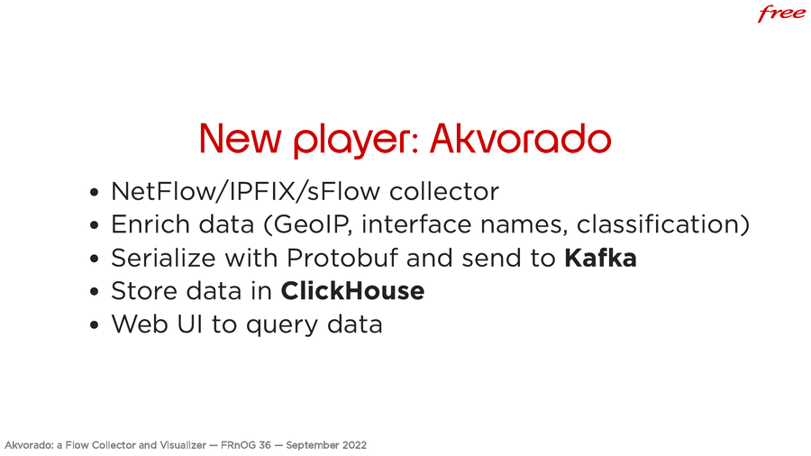
At Free, we have built our own tool, called Akvorado, which means “water wheel” in Esperanto. If you type that in Google, you are pretty sure to find us. It’s a NetFlow/sFlow collector. It adds more information with GeoIP, classification rules, interface names, and serialize to Protobuf. Kafka is used as a buffer. Then, data is stored in a ClickHouse database. There is a web interface to display the results.
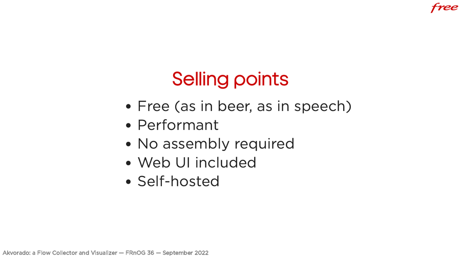
It’s free (beer and speech). It’s quite performant. Everything is bundled: it is easy to deploy. It is not as flexible as your own custom solution, where you can choose each component. The whole thing is imposed on you, but it allows you to get something quickly. Again, there is a web interface. It’s a big pro compared to other solutions where you need Grafana or Kibana. You have to host it yourself. Depending on how you see things, this can be an advantage or not.
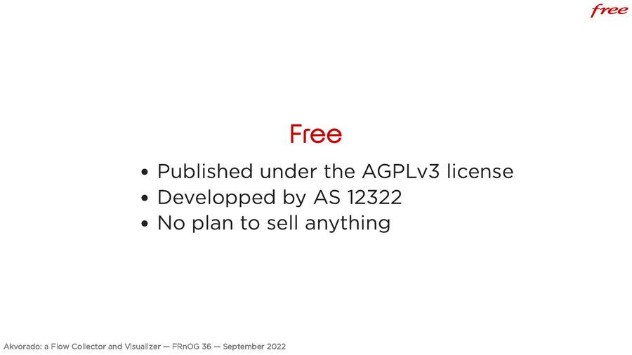
It’s free (speech and beer). It’s published with the AGPLv3 license. It is an internal tool we use at Free. We have no plan to sell it or sell services around it. It should stay free quite some time.
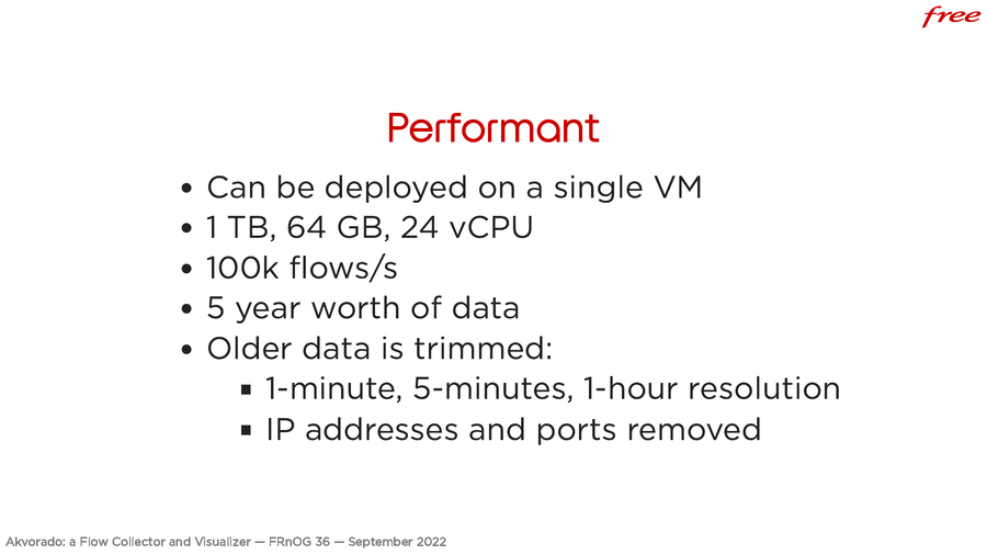
About the performances, I was quite surprised. This is quite performant, because, today, we are still running it on a single VM with 1TB of storage, 64 GB of memory, and 24 vCPU. We are handling 30,000 flows/second, but looking at the stats, we should be able to go up to 100,000 flows/s on this single VM, while keeping 5 year worth of data.
When data are getting older, they are aggregated over 1 minute, 5 minutes and 1 hour. IP and ports are also lost. Not keeping the IP addresses for too long is a good thing, nonetheless. This is configurable. With our setup, we should be able to keep data for 5 years. As the project is still young, we will see if that’s true.
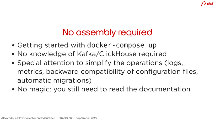
One way to deploy is to use Docker. You can download the project, run
docker-compose and get something working. No need to know Kafka or ClickHouse,
but this can help. There is a very special attention that has been paid to the
operations. There are logs and metrics. We try to not break user configuration
during upgrade, even if this does not always work. ClickHouse migrations are
automated. There is a documentation you can look up.
A big pro is the web interface. We are quite happy about it. You can test it on demo.akvorado.net.
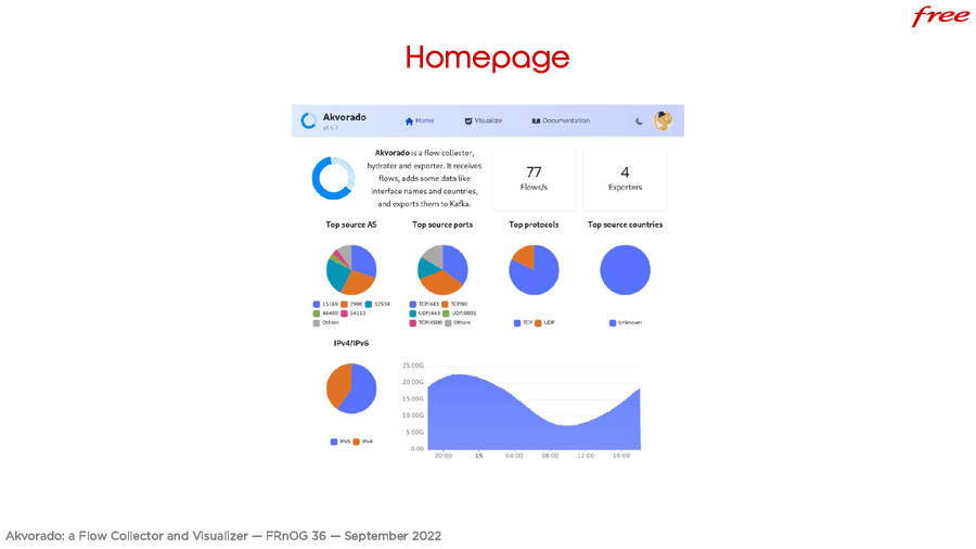
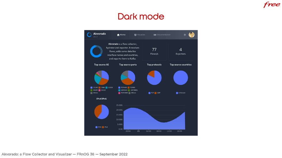
Here is the home page with some widgets, a dark mode which makes it apart from the competition.
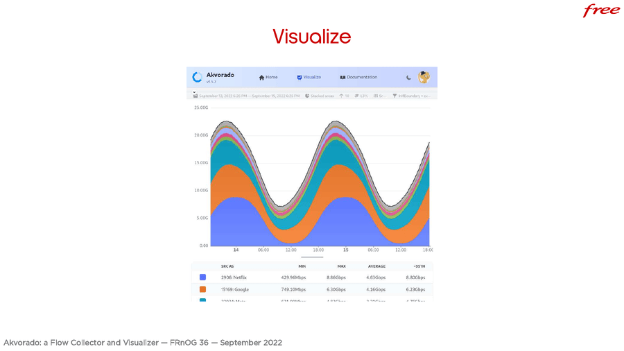
The “visualization” tab is the most interesting. You can check your data. It looks like Kentik. Dunno why.
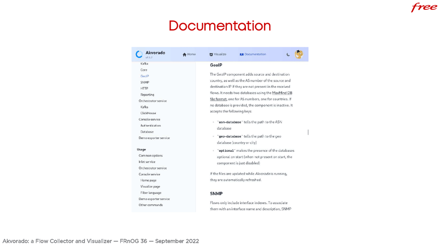
The documentation is builtin.
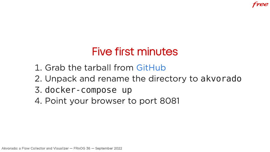
As I said, getting started is easy. You download the tarball on GitHub, unpack
it in a directory named akvorado, run docker-compose up point your browser
to port 8081 and you get the demo site. Without the data. You need to wait a bit
to have fake data.
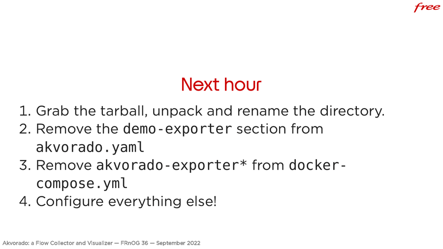
If you have a bit more time, you can remove the part generating the random data
from Akvorado configuration file (which is written in YAML) and also from
docker-compose, which starts the services to generate the data. Then, you can
configure everything else. It’s easy.
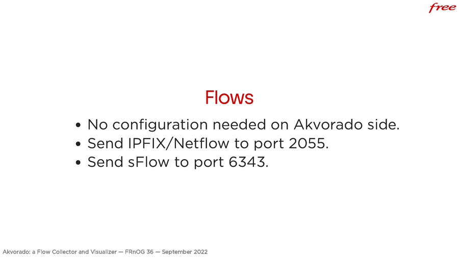
About flow configuration. Akvorado accepts flows from anyone. There is nothing to configure. Send NetFlow/IPFIX flows on port 2055 and sFlow on port 6343.
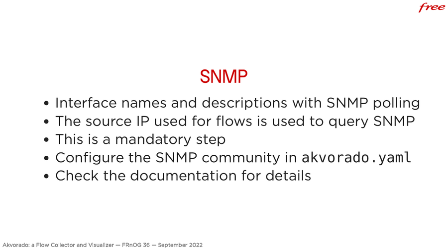
Then, you need to configure SNMP. It’s not super modern but it is widely supported. Currently, this is not really flexible. When sending flows from a given IP address, Akvorado uses the same IP to send SNMP queries, to fetch the router name and interfaces. This is mandatory to configure that. Fill up the community. You need to configure your routers to accept SNMP requests.
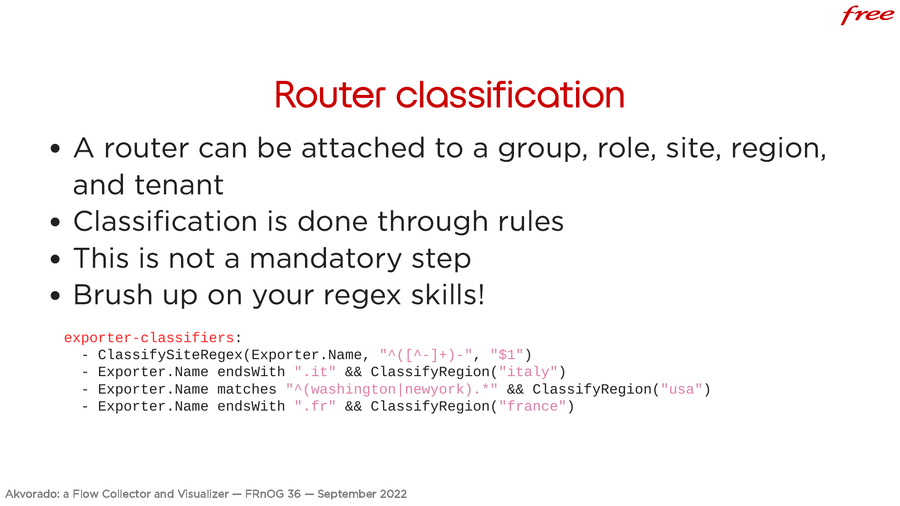
The second point is that, for each router sending flows, you can use classification rules to add a group, a role, a site, a region. It is done with rules. This is not mandatory, but this is a good warmup for the next step, to work on your regex skills because it relies on it a lot.
As an example, at Free, we name our devices th2-something, with the name of
the site on first position. The first rule says that from the exporter name, we
capture what is before the first dash and it will be the site name. Then, if it
ends with .it, the region is Italy. If it starts with Washington or New York,
the region is USA. If it ends with .fr, the region is France. You can assemble
more or less complex rules.
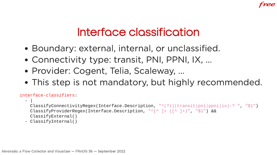
Following the same idea, it is possible to classify interfaces. It is not mandatory but it is quite important. You really should do it. For each interface, we have a boundary which says external, internal or unknown. It is important to classify interfaces on this criteria. You can also attach a connectivity type. This could be transit, PNI, IX, etc. A provider (who is on the remote side).
We use the same kind of rules. Here is a more complex example. We take the
interface description. If it starts with transit, PNI, PPNI, etc., this part
will be the connectivity. A && is missing from the end because the rule is not
over. If it matched, we use the second word that is the provider name. For
example, at Free, we use Transit: Cogent and some other stuff. Here, we will
capture Cogent. If both rules matches, we also consider this is an external
interface. For everything else, we consider this is an internal interface.
That’s the only thing to do for a basic deployment. You can check if everything works on the web interface. Check the documentation for the various configuration settings. There is also a troubleshooting section which should help if you can’t get your flows in the interface. The metrics will help in this case.
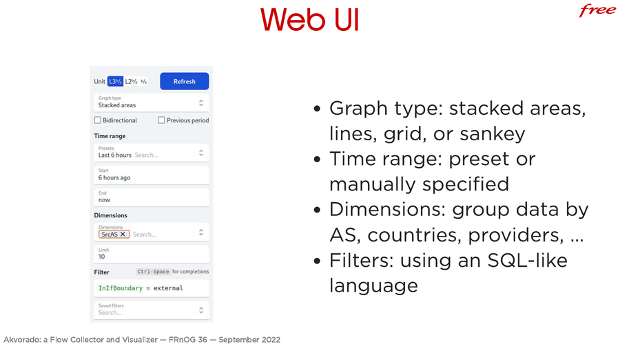
The web interface. You can draw several kind of graphs. Do you want stacking areas? Just lines? On a grid (each graph in its own box)? Or maybe a “sankey” graph (if you don’t know what this is, I have an example later)?
You choose the time period to extract the data. Data can be grouped using dimensions. You can group by AS, country, provider, etc. You can filter the data. It uses an SQL-like language. An editor with completion is here to help. It may be a bit raw, but with the completion, I think you should quickly get what you want.
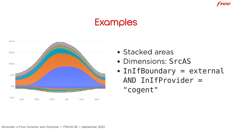
Here are a few examples. Here, we have used the stacked areas. Each color is a source AS. The filter is… the input interface should be classified as external and the provider is Cogent. It shows what we get from Cogent, grouped by the AS number. Here, we have enabled the “bidirectional” option. You have the input and the output. Akvorado automatically inverts the filter to get the second part of the graph.
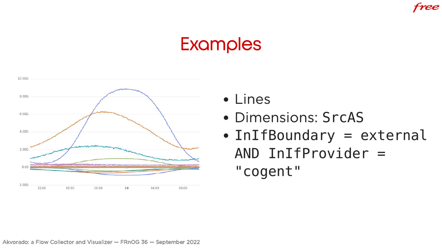
Here, this is the same plot with lines. Stacking areas is handy to see the total, but this is difficult to compare the value of each area. With lines, we can easily see the orange line is always lower than the blue line and this was not easy to see when using stacked areas.
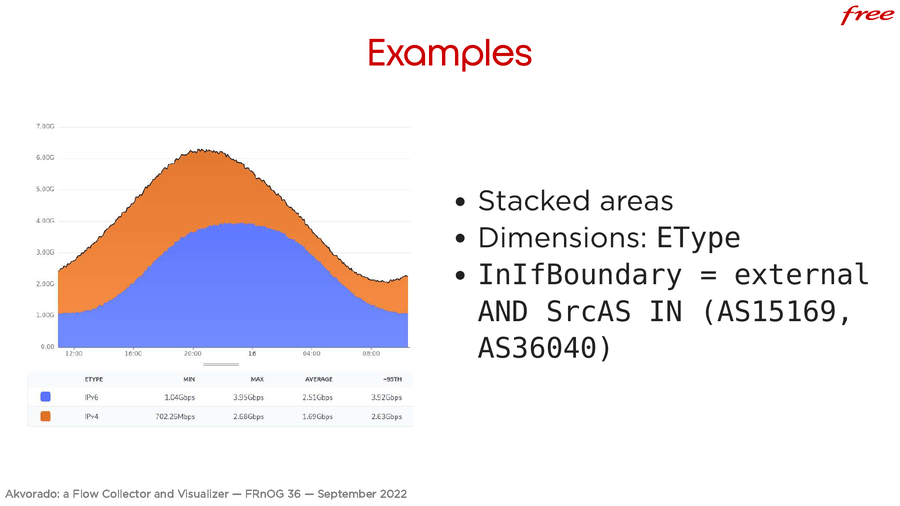
Another example, still with stacking areas. We group by “Ethernet type” (IPv4, IPv6) and we use a more complex filter. The source should be one of the Google AS, and we get this result.
Other solutions are using Grafana. Its templating language is more limited. You have place holders in your SQL requests that get replaced by values in drop down menus. You may have to create several dashboards depending on the kind of query you want to run. Maybe dropdown menus are enough, like when filtering per AS or per country, but for some things, you will have to create several dashboards. Here, we have a tool specifically created for network flows.
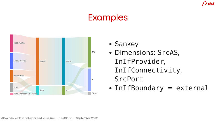
Here is the “sankey” graph. You can see the flows going from one dimension to another. Each column is a dimension. We have the source AS, the input provider, the connectivity type and the source port. Most of the traffic goes through Cogent, which is a transit provider. Two thirds of the traffic comes from port 443. A small part of the traffic comes from an IX (DECIX). It is a convenient graph to see where your traffic goes.
About the AS names, I don’t know if you have noticed, but the AS names are quite clean. It is often a problem we have. PeeringDB is clean but does not have all the AS names. The RIR databases have all of them, but as it’s difficult to update, there are AS with odd names. For example, Netflix is AS-SSI.
I have published a small project mixing several data sources. There are rules to clean up the names. This is exported as a CSV file. It’s updated weekly. Fetch it if you need it. It also uses DB-IP as a source instead of ARIN. ARIN license does not allow me to fetch the data I need to extract the AS names.
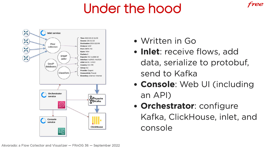
Akvorado is split in 3 parts. It’s written in Go. There is the “inlet.” It receives the flows, adds more data, serialize them and send the result to Kafka. The console component serves the web UI and an undocumented API. The orchestrator component configures the other components, including the external ones, like Kafka and ClickHouse. It configures them, creates the tables, etc. It’s one of the reason it works out-of-the-box.
On the drawing, you can see how the flows are built from the various bits received from NetFlow and IPFIX, and data extracted from SNMP. The AS numbers can come from flows or GeoIP databases. The country is from the GeoIP databases. The classifiers add more information. This makes the final flow sent to ClickHouse.
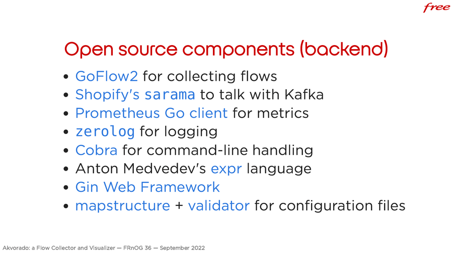
Open source components. We use GoFlow2 to collect network flows. Sarama for
Kafka. For metrics, this is the Prometheus client in Go. zerolog for logging.
cobra for the CLI. The expression language for classification is expr. Gin for
the web framework. Mapstructure and validator to parse and validate
configuration files.
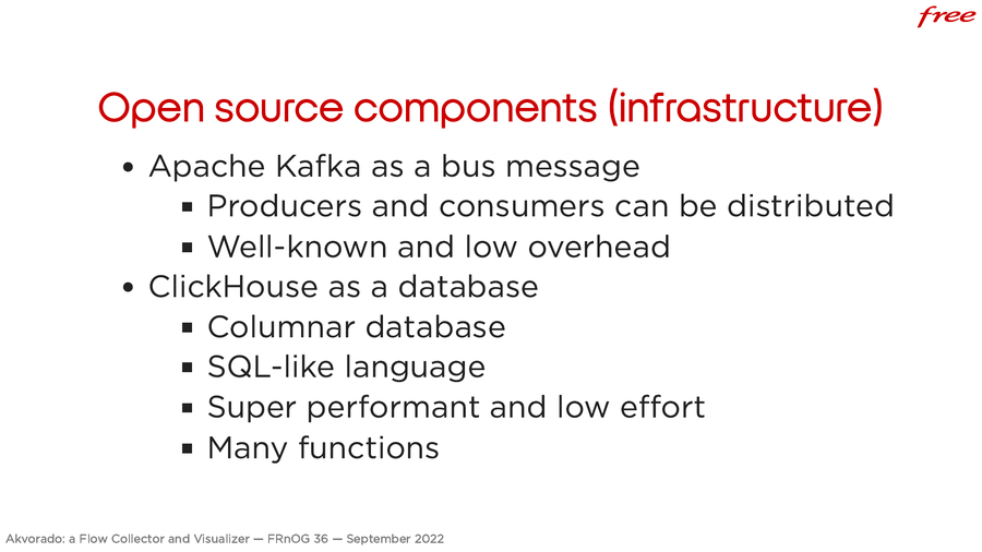
For the infrastructure side, there is a Kafka broker in the middle. It’s quite useful to distribute consumers and producers. The inlet component can be distributed. You can put everything on a single VM, but, if you want, you can use several NetFlow collectors and they write into the same Kafka cluster.
Also, if you want to stop ClickHouse, you can. There is no data loss. Kafka acts as a buffer. When ClickHouse starts again, it will resume from the last ingested flow. That’s why this is interesting to use Kafka. And that’s why it is a common component in many projects. It’s not hard to manage.
ClickHouse is a columnar database. Data are stored column by column instead of line by line in a regular database. It allows one to extract huge chunks of data quickly. Compared to other columnar databases, it uses a SQL dialect which looks like regular SQL. It is quite versatile and there are a lot of functions available. It can be performant without putting much effort into it.
At Free, we are still using the VM that was provided for testing. It handles the load without a sweat. ClickHouse stays fast. I can’t do a demo, but most requests are executed in less than a second except for a few cases.
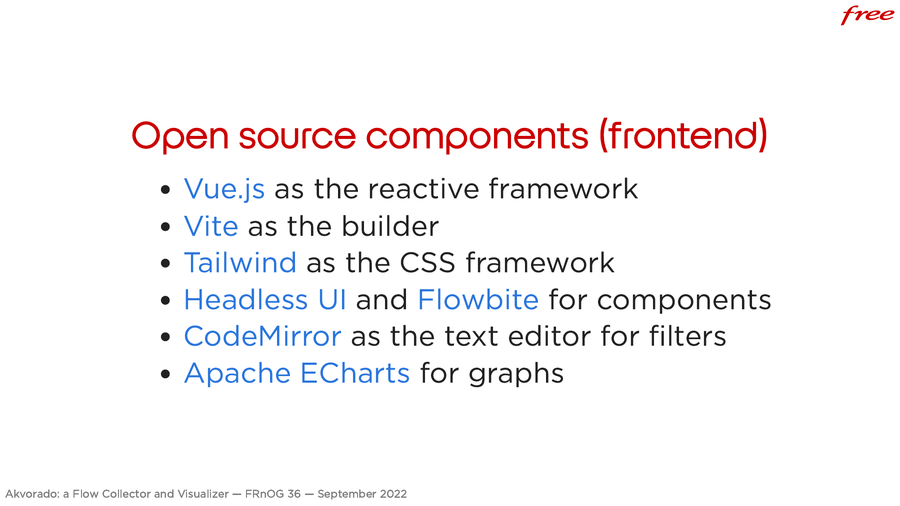
The web frontend was the most painful part to write. JavaScript has a lot of frameworks. Here are the components we use in Akvorado. One of the most important is the one handling the graphs. It is Apache ECharts. It is featureful, flexible, and quite bug-free. Please, look at the demo on their website to check the available features. If you want to write a tool with graphs to display, have a look at it. It is not trivial to use, but it had all the features I needed.
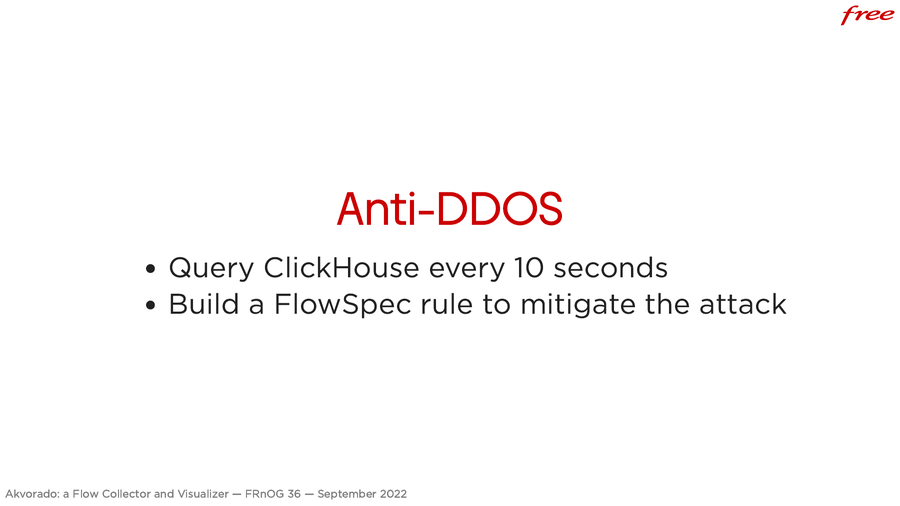
A feature that is not available yet, but as we have a lot of data in ClickHouse, we can build a primitive anti-DDoS system. We can run SQL requests on the data in ClickHouse. You run the request to detect a DDoS in a script triggered every 10 seconds. And from the result, you can build a Flowspec rule. It is injected in a BIRD instance and routers connect to it to fetch the current Flowspec rules.
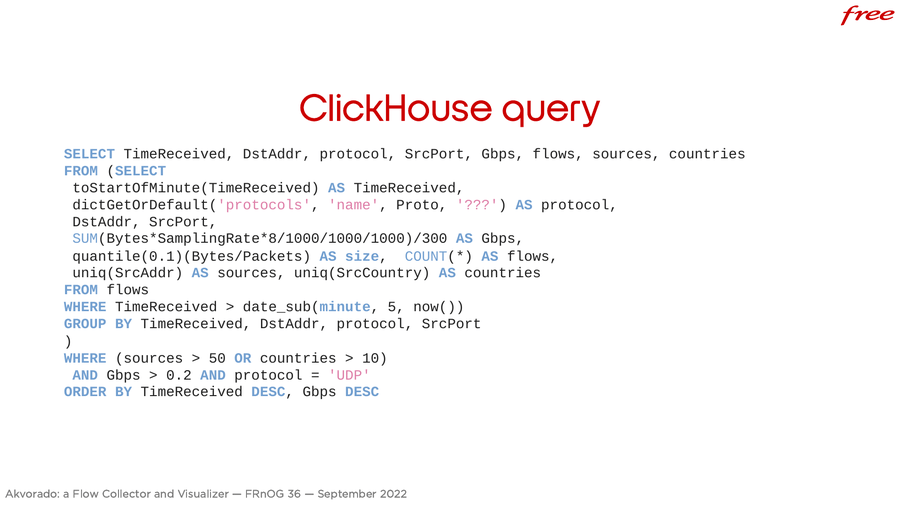
As an example, here is one of the requests we use. It detects UDP amplification attacks. It is a bit complex, but let’s decipher it. Data are grouped minute by minute. We look at the 5 last minutes.
We group by destination IP address (that’s the IP we want to protect). We group by protocol to filter on the UDP protocol. We group by source port, because during an UDP amplification, the source port is known (it could be NTP for example).
We compute the bandwidth in bytes per second. A quantile for the packet size is computed. It’s one of the many features of ClickHouse. It allows us to easily compute quantiles. We count the flows, the number of unique source IP addresses, the number of unique countries. When there are more than 50 sources or more than 10 countries, and when we have more than 200 Mbps, and that the protocol is UDP, it looks like an UDP amplification attack.
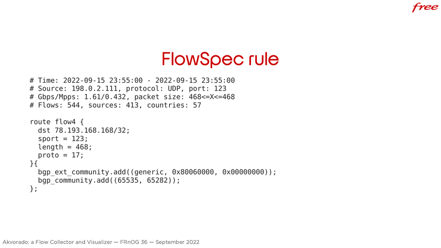
We create a Flowspec rule that looks like this. For the target IP, when the source port is 123, and the packet length is 468, the protocol is UDP, we drop the packet. We don’t rate-limit because legitimate flows will be flooded by the illegitimate ones and they will be dropped too. Using Flowspec is nice: we not only restrict one source port, but also a specific packet size. Legitimate NTP packets are never 468 bytes. It’s always smaller. The customer will be protected and won’t notice a thing.
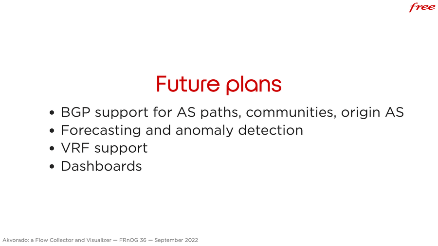
As for the planned features, we are working on the BGP support to get AS paths, communities, and origin AS, notably when they are internals as we can’t get them from GeoIP. It will be available soon. We will also implement traffic forecasting. And maybe anomaly detection as it gets together. It should enable you to check your capacity planning for a router.
VRF support is also planned. We don’t need it yet. We only support one VRF because we are only using Akvorado for our public traffic.
Dashboards are also planned. However, you can currently bookmark the URL. The URL contains a hash of the request. You can share them with a colleague to show the result of a request you built. Or save it somewhere.